The style of your video will depend on a number of factors. Splainers will work with you to develop a custom style for your project. Similar to your script, it usually comes down to two things: your audience and your message.
Who is your audience?
Broad vs. Targeted
-
- Are you speaking to a wide range of people with different life experience and knowledge? Then perhaps you should be grabbing them emotionally, or conveying things in the most accessible way possible. This might mean using broadly relatable characters.
- Are you speaking to a very specific group with a common interest or need? Then you might want to get right to the facts. This might be more reliant on motion graphics and charts to convey specific terminology or concepts.
Internal vs. External
-
- Whether your message is going to your own crew or to the public, its style should support your organization’s culture and brand.
- Custom and specific videos build affinity both with your workforce.
- External videos are your opportunity to introduce your ideas as well as your organization’s personality to the world.
What is your message?
Emotions and Facts:
-
- Are you tugging on heartstrings, or dealing with sensitive issues? Perhaps softer colors are in order. Characters with less features carry less baggage.


-
- Are you explaining a complex or dry concept? Dynamic motion graphics help keep the audience engaged. Alternatively, a lighter approach, perhaps through metaphor, can draw your audience in, conveying high level concepts that would otherwise have eyes glazing over.


-
- What do you want the video to say about you? Are you approachable? Fun? Serious? An authority?
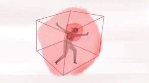
- Need to get serious? More realistic looking characters add weight to the story. We often incorporate silhouetted realistic characters. This allows for realism without the specific details that can hinder affinity.
- Perhaps approachability is what you’re after. A more handmade feel could bring your high concepts down to earth.
Our toolkit
Splainers prides ourselves on our ability to adapt and change to fit your specific needs. Here are a few methods we currently use and why.
Animated characters: Characters build affinity with the viewer. They can be a stand-in for “you” or your colleagues. The level of detail can affect how relatable a character is:


-
- Simple characters, with minimal features are often easier to relate to.
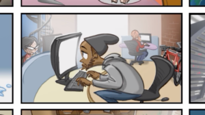
- More detailed characters might be necessary to ground a story in a real world context.
- In some cases we use silhouettes of realistic characters to ground the story while minimizing distracting faces.
Do you want to convey diversity with your cast of characters? Or is individual identity a distraction to the story you are telling?
Motion Graphics: Complex ideas need to be boiled down and understood in seconds. Motion graphics can be a great way to do this. We find the essence of the concept and bring it to life. Most of our videos mix motion graphics and character work.
Draw along: An effective way of telling a story with rich settings and distinctive characters is known as the draw along method. Here, otherwise static illustrations are drawn out over time. This method can be a time efficient and cost effective alternative to fully animated work. The hand drawn aesthetic is very accessible to viewers.
Live action: Sometimes there’s no substitute for the real thing. Real people telling their own story can be incredibly compelling. Our live action work is often supplemented by motion graphics to clarify the concepts the people are referencing. Proper videography and concise editing are key to making these stories come to life.
Paper cutouts: This method moves paper cutouts of characters and settings to create another “homemade” style of animation. As with the draw along style, this eliminates extraneous movement to keep focus on the message
THE SPLAINERS STYLE GUIDE
Moving Text

Pros
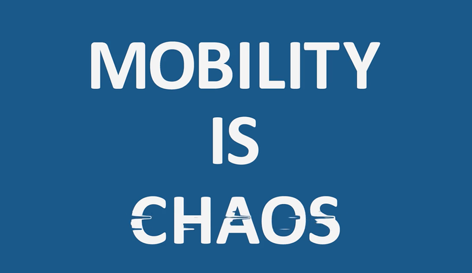
Thanks to companies like Apple, videos making use of prominent text and the occasional object have become quite popular. Done right, videos of this type can be truly elegant. With few or no people, they literally put the message front and center. This also makes them ideal for viewers who watch video with the sound turned off (work places and trade shows).
Cons
There are several downsides to text-based video. First of all, even if they make a good impression on the viewer, the actual content of the message is unlikely to be very memorable without the reinforcement of interesting visuals. In addition, text often limits your audience to highly-literate native speakers. Therefore, unless you have a top-notch copywriter on board, it’s difficult to produce a video that’s compelling.
Conclusion
Companies that use this video style are often perceived as authoritative and brand-driven. What they *say* clearly matters. They are either above petty imagery or everyone already knows their products.
Stick Figures / Whiteboard

Pros
Over the past 10 years, videos based on stick figures, amateurish drawings and paper cutouts have taken the marketing world by storm. Much of this is thanks to the amazing work done by Common Craft. And all for good reason. Videos done in this simple style clearly show they are on the side of Everyday Joe. They are fun and casual – two things most viewers identify with. Moreover, the simplicity of the characters places a clear emphasis on what is actually happening in the video. Lastly, these characters generally allow you to avoid issues of gender and race within your video.
Cons
Stick figures are sometimes associated with and irony and amateurism. Moreover, viewers don’t identify as closely with stick figures as they do with realistic or photorealistic images of people. Though these videos might seem easy to produce, they quickly unravel without a well-written script.
Conclusion
Companies that use stick figures in their videos are fun, practical and user-centric. They are young-at-heart and don’t mind poking fun at themselves.
Draw-along Animation

Pros
Draw-along videos use a hand or pencil to show you in ‘real-time’ what you need to be looking at. Stylishly simple, they’ve become quite popular over the past 5 years or so.
Cons
While they do bring attention to a central point on the screen, it is easy for the act of drawing to become a kind of distraction from the key messaging. Like flat design, it’s also unknown how long this style will continue to look fresh.
Conclusion
If you’re going with this style, make sure you have a great script and are using an experienced producer. If not, it’s easy for the video to turn into quite a mess.
Simplified Characters

Pros
Splainers has had much success with simplified characters such as our ‘Flat People.’ By marrying simplicity with the ability to show diversity, this type of character borrows many benefits of stick figures while minimizing some of the downsides. Moreover, because they are created to be multi-ethnic and have recognizable facial expressions, viewers have an easy time identifying with them.
Cons
As with any set of characters designed to appeal to a wide audience, simplified characters may be a little bland for some companies. They also aren’t crude enough to achieve that uber-cool quickly sketched-out aesthetic.
Conclusion
Though they don’t always push the envelope, ‘Flat People’ are effective storytellers because they can carry the message without overwhelming it. Moreover, using them in your video costs much less than highly-stylized characters.
Flat Design

Pros
In all the creative industries, ‘flat design’ has been quite the rage the past couple of years. In addition to largely doing away with outlines, flat design utilizes a warm color palette and simple forms. This gives your video an ultra-contemporary look that connects well with younger audiences. Another benefit is that a hosted ‘flat design’ video on your website will often stick out and contrast well with the other content.
Cons
Like all trends, we don’t know how long flat design will be the flavor-of-the-month. This may mean the shelf-life of your video is shorter than if you go with a more simple style. Likewise, because flat design features corner-to-corner color, it’s more difficult to create a visual hierarchy that supports the central takeaway.
Conclusion
If your video is targeting a young audience and doesn’t really need to stand the test of time, flat-design is definitely something to consider. It will certainly make you look in-tune with current design trends.
Highly-Stylized Animation and Movement

Pros
The biggest benefit of stylized animation is that it can be tailored to your exact needs and brand image. From baroque to Japanese manga, the choices are endless. Character expressions and clothing can be done in extreme detail to show your company’s dedication to production values and style. Viewers often get excited when they see fresh and well-drawn animation.
Cons
A pitfall of great production values is that they may actually overwhelm the story or product. Excessive movement in particular is often a killer of message retention. Moreover, ordering highly-stylized animation may potentially add extra time to the production schedule.
Conclusion
Highly-stylized animation is for companies that want to focus on aesthetic. It’s also great for organizations with a reputation for quality and attention to detail.
Stop-action

Pros
Stop-action marries the best of animation and live action. Though we can identify that the characters are real, we can use this technique to have them do some pretty unreal things. Stop-action also has a fun yet old-fashioned feel that delights viewers.
Cons
It is difficult for viewers to view stop-action animation as anything but playful. Moreover, the production process is not as easy (aka time & money) as it looks.
Conclusion
Companies that use stop-action videos are creative and playful, yet grounded in the real world.
Live Action

Pros
Live action is based on the world we all know. Characters and products are instantly identifiable. As popular as animation continues to become, it will never fully replace live action.
Cons
Location shooting takes time and money. Good lighting, editing and acting takes much more skill than people realize. The physical realities of the real world are also quite limited compared to the infinite possibilities of animation. Lastly, it’s easy for live action videos to become about the people instead of the audience and story.
Conclusion
Live action is great for interviews and videos that rely on real characterizations. However, it takes a surprising amount of skill and budget to make a live action video that looks polished.
To find the style that is right for you, contact Splainers at 425.890.4081 or info@splainers.com
